Medique
WordPress Theme
- by: Webique Themes
- website: webique-themes.com
- email: webique.themes@gmail.com
We appreciate that you have chosen Medique! Before you get started, please be sure to read our Documentation. We outline all kinds of good information, and provide you with all the details you need to use the theme. If you like this theme, please support us by rating us 5 stars on ThemeForest.
General
Introduction
We appreciate that you have chosen Medique! Before you get started, please be sure to read our Documentation. We outline all kinds of good information, and provide you with all the details you need to use the theme. If you like this theme, please support us by rating us 5 stars on ThemeForest.
Theme License
When purchasing Medique from ThemeForest, you have two licensing options. The Regular License, and the Extended License. The billing, licensing terms and process is purely handled by Envato (the company who owns ThemeForest), and we have no control over these aspects. To learn more about what each License is for, and which one to purchase, please visit this License article.
Frequently Asked Questions:
Yes. One purchase of Medique allows you to use the theme on one finished site. If you need to use it on a second site, it requires you to make a second license purchase.
Yes, you can. You can keep the theme on a test site to build it, then move it to the live site once you are finished.
According to the licensing rules set by Envato, this is not allowed. If it is installed in two places permanently, then it requires two licenses.
Plugins License
Medique comes bundled with two third-party plugins — WPBakery Page Builder and Slider Revolution, which do not require additional licensing in order to use them with the theme. According to the rules of Envato, we cannot share the plugins' license keys with our clients. Instead, we are accountable for providing our customers with with the newest versions of plugins, which usually come with the latest theme update. If you have any further questions about the licensing, we recommend you to read
more in the articles by the authors of the plugins at the links below:
https://kb.wpbakery.com/docs/faq/can-i-update-wpbakery-page-builder-if-i-have-purchased-it-in-a-theme/
http://www.themepunch.com/faq/how-to-update-the-slider/
Frequently Asked Questions:
These plugins require a license key to activate the automatic update feature. Once you activated them in the Plugins menu, they are fully ready to use. You can ignore those messages.
Every update of the theme also includes updates for Slider Revolution and WPBakery Page Builder. However, this does not mean that you will receive an individual license for these plugins. Due to Envato’s licensing rules, we can only issue updates for these plugins when we issue a theme update. This also ensures that we fully test the plugins to make sure there are no critical bugs that will conflict with our own update.
Theme Support
All of our items come with 6 months of included support and free lifetime updates for your theme. Once the 6 months of included support is up, you have an opportunity to extend support coverage up to 6 or 12 months further — you can read more about extending your support coverage here in this article. If you choose not to extend your support, you will still be able to submit bug reports via email or item comments, and still have access to our online documentation.
Please be informed that due to Envato item support policy our support is limited to questions regarding the theme’s features or problems with the theme. We are not able to provide support for any code customizations or third-party plugins not officially supported by the theme. You can read more about Envato item support here.
Before submitting a ticket:
To help speed up your request, we require you to follow the steps below before submitting a support ticket. This is for the benefit of everyone and will help make the entire process more efficient.
Please check the following before you create a ticket:
- Make sure you are running the latest version of the theme and the latest version of WordPress.
- Search in our documentation for an answer to your question.
- Disable any additional third party plugins not officially supported by the theme to see if it fixes the issue.
- Switch back to a default theme (e.g. Twenty Nineteen) to see if it fixes the issue. If it does, you can ensure this is a bug of Medique.
Frequently Asked Questions:
The only thing that changes is that you will not be granted access to hands on support. You will however continue to receive theme updates that contain bug fixes, patches and new features.
There are 3 scenarios when you can extend or renew item support:
- Support Upgrade: At the time of purchasing the item. This will cost 30% of the list price, or 37.5% on the item price.
- Support Extension: Extend item support before it expires. This will cost 50% of the list price, or 62.5% on the item price.
- Support Renewal: Renew item support once it has expired. This will cost 70% of the list price, or 82.5% on the item price.
You can send us your tickets on our website. Please do not forget to include your purchase code.
Installation & Update
WordPress Configuration
To install this theme you must have a working version of WordPress already installed. If you need help installing WordPress, follow the instructions at WordPress Codex. Below are all the useful links for WordPress information.
- WordPress Codex – General info about WordPress and how to install on your server.
- First Steps With WordPress – General info about multiple topics about WordPress.
- FAQ New To WordPress – The most popular FAQ’s regarding WordPress.
After installing WordPress, please make sure to increase PHP configuration limits. You can do this on your own, or contact your web host and ask them to increase those limits to a minimum as follows: find the .htaccess file on your server, which is usually located in the root directory of your WordPress installation, open it, and add the following code to the very end of the file:
php_value post_max_size 64M

php_value upload_max_filesize 128M

php_value max_file_uploads 128M

php_value max_input_vars 5000
Some hosting providers may not provide an access to the .htaccess file. In this case, it is advisable to contact your hosting provider for the further help with modifying the file.
How To Install Your Theme
There are two ways you can install Medique. You can choose to install it via WordPress or via FTP. Before installing the theme, you need download the necessary theme files from your ThemeForest account.
Install via WordPress
- Download “All Files and Documentation” package from Themeforest and unzip it.
- In unzipped folder, you will find medique.zip file.
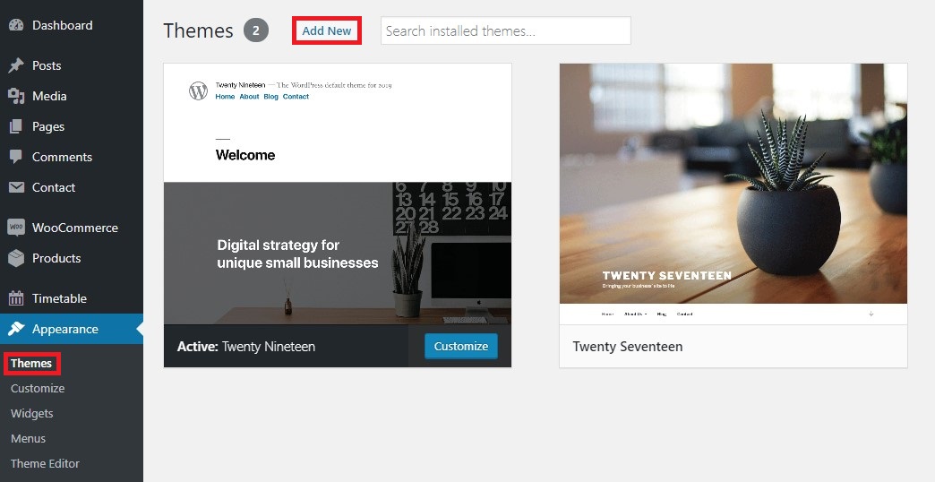
- In your WordPress Dashboard go to Appearance — Themes.
- Click on Add New Theme, click Upload Theme, browse the medique.zip file, and click Install Now.
- After installation is complete click on Activate Theme.
Install via FTP
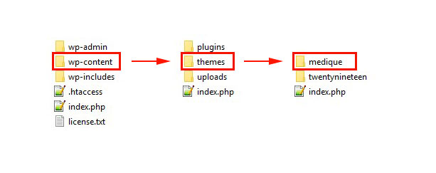
- Connect to your server via FTP software.
- Extract medique.zip file and upload only extracted medique folder to /wp-content/themes/ directory on your server.
- Navigate to Appearance — Themes and activate Medique.
Theme Setup Wizard
Once you activated Medique, you will be redirected to the setup wizard as shown in the image below. The setup wizard will guide you and automatically install child theme and our recommended plugins, as well as import the demo content and settings in a few simple steps.
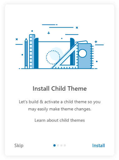
Install Child Theme
This step provides important information on theme customization, as here you will be asked to install a child theme — a theme that inherits functionality of its parent theme, and allows you to make modification or add additional functionality to the parent theme without changing it. It is the safest and easiest way to modify an existing theme, whether you want to make a few tiny changes or extensive customizations. Please go through the information and click Install.
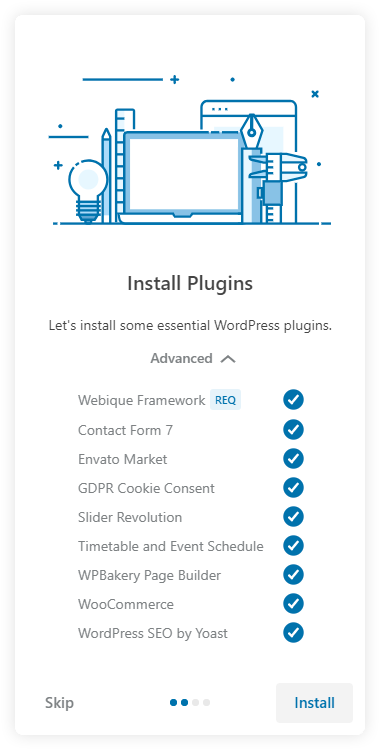
Install Plugins
Medique comes up with a few essential plugins needed for the theme proper functionality. In Advanced menu you can choose, which of the essential plugins to install, but in order for the theme to work properly, we recommend installing all the suggested plugins.
Click Install to install plugins.
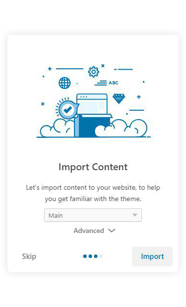
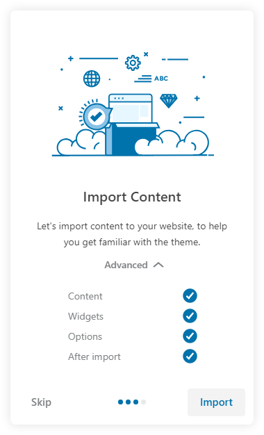
Install Demo Content
The next step is to insert demo content for your new WordPress website. You will be asked to choose from the demos, which correspond to the ones present on our demo website. In Advanced menu, you can choose which parts of the demo content you want to import, but we recommended leaving everything selected. Once imported, this content can be managed from the WordPress admin dashboard. Choose a demo and click Import to install demo content. Please note that the images from our demo website are not included in the demo content, so you will get placeholder images instead.
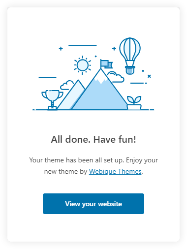
Congratulations, you have successfully set the theme, the plugins, and the demo content up and running!
Theme & Plugins Update
There are 3 ways to update your theme: use Envato Market plugin for automatic theme updates or manual update the theme via FTP or WordPress. After updating the theme, all your content such as pages, options, images and posts will not be lost or erased by doing this. However, any customizations to the theme’s core files, such as PHP files, language files will be lost, so it is recommended to use child theme for any customizations and backup the lang files if you translated the theme.
Method 1: Automatic Updates (Recommended)
The Envato Market plugin can install WordPress themes and plugins purchased from ThemeForest and CodeCanyon by connecting with the Envato Market API using a secure OAuth personal token. Once your theme and plugins are installed, WordPress will periodically check for updates, so keeping your items up to date is as simple as a few clicks.
- Check whether the Envato Market plugin is installed and active in the Dashboard in Plugins — it is installed automatically along with other essential plugins during the theme and plugins installation via Theme Setup Wizard, unless you unchecked it or skipped the plugins installation step altogether. In case the plugin is not installed, please proceed to Appearance — Theme Plugins and install/activate it.
- If you have translated the theme, please back up you translation files from /wp-content/themes/medique/languages/ and /wp-content/plugins/webique-framework/languages folders.
- Please follow this tutorial to sync Envato Market plugin with your Envato account omitting the installation and activation part.
- After updating the theme, proceed to Appearance — Theme Plugins and update the required plugins.
Method 2: Manual Update Via WordPress
- Download the theme from ThemeForest in the Download menu on ThemeForest and extract it to your computer.
- Go to Appearance — Themes and deactivate Medique theme. To deactivate it, simply switch to a different theme, e.g. the default WordPress Twenty Nineteen theme.
- If you have translated the theme, please back up you translation files from /wp-content/themes/medique/languages/ and /wp-content/plugins/webique-framework/languages folders.
- After deactivating the theme, you can go ahead and delete it. To do this, hover over the theme thumbnail then click Theme Details. In the bottom right corner of the window, click the Delete button. Upload, install and activate the new version of the theme downloaded in the step #1. All your content such as pages, options, images and posts will not be lost or erased by doing this. However, any customizations to the theme’s core files, such as PHP files, language files will be lost, so it is recommended to use child theme for any customizations and backup the lang files if you translated the theme.
- After updating the theme, proceed to Appearance — Theme Plugins and update the required plugins.
Method 3: Manual Update Via FTP
- Download the theme from ThemeForest in the Download menu on ThemeForest and extract it to your computer.
- Access your server via FTP or SFTP (Filezilla is a free recommended program).
- If you have translated the theme, please back up you translation files from /wp-content/themes/medique/languages/ and /wp-content/plugins/webique-framework/languages folders.
- Browse to /wp-content/themes/
- Delete the current theme folder (folder medique) and upload the new one downloaded in the step #1. All your content such as pages, options, images and posts will not be lost or erased by doing this. However, any customizations to the theme’s core files, such as PHP files, language files will be lost, so it is recommended to use child theme for any customizations and backup the lang files if you translated the theme.
- After updating the theme, proceed to Appearance — Theme Plugins, and update the required plugins.
Theme Settings
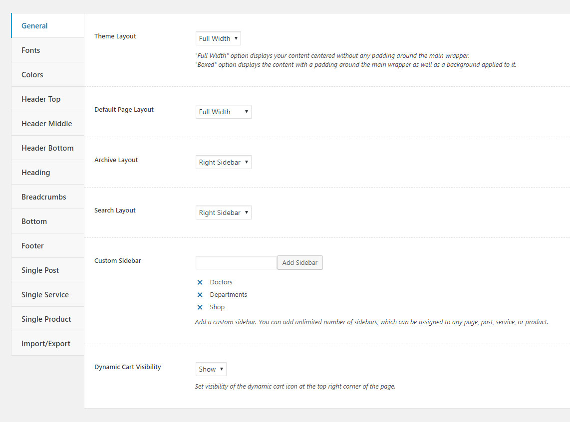
General
This section contains the most basic settings of the theme.
-
Theme Layout — here you can manage your website's layout type, there are two options:
- "Full Width" displays your content centered without any padding around the main wrapper;
- "Boxed" displays the content with a padding around the main wrapper as well as a background applied to it.
- Default Page Layout — here you can choose the default page layout. There are three options: full width without sidebar, left sidebar, and right sidebar. Archive Layout controls layout for archive pages, such categories and tags pages, and Search Layout controls search page layout.
- Default Background Color and Default Background Image — allows you to set a default background color and image throughout the website, including archive and search pages. The options only available with Boxed layout.
- Custom Sidebar — here you can create custom sidebars, which can be used along with the default ones.
- Dynamic Cart Visibility — controls visibility of the dynamic cart at top right corner of the page,
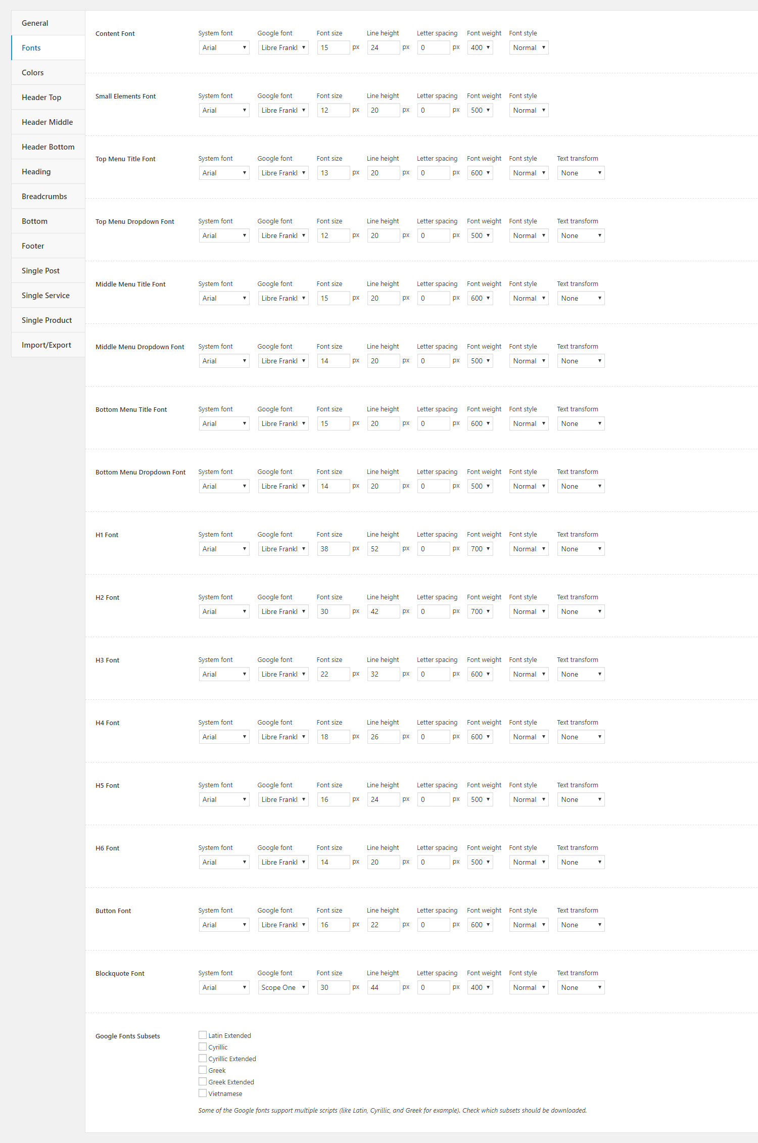
Fonts
In this section you can select and customize all the theme fonts using included system and Google fonts.
In Google Fonts Subsets option you can set which scripts (like Latin, Cyrillic, and Greek for example) will be used on your website.
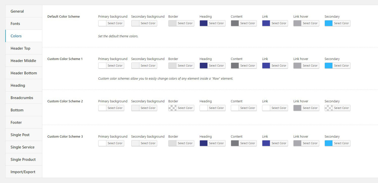
Colors
In this section you can customize colors used in the content area of the theme.
Default Color Scheme option controls all the colors used in the content area by default, while Custom Color Scheme options are used to set colors in individual "Row" elements, allowing you to differently customize parts of the content area.
Header
This section contains settings for configuring the three parts of the header.
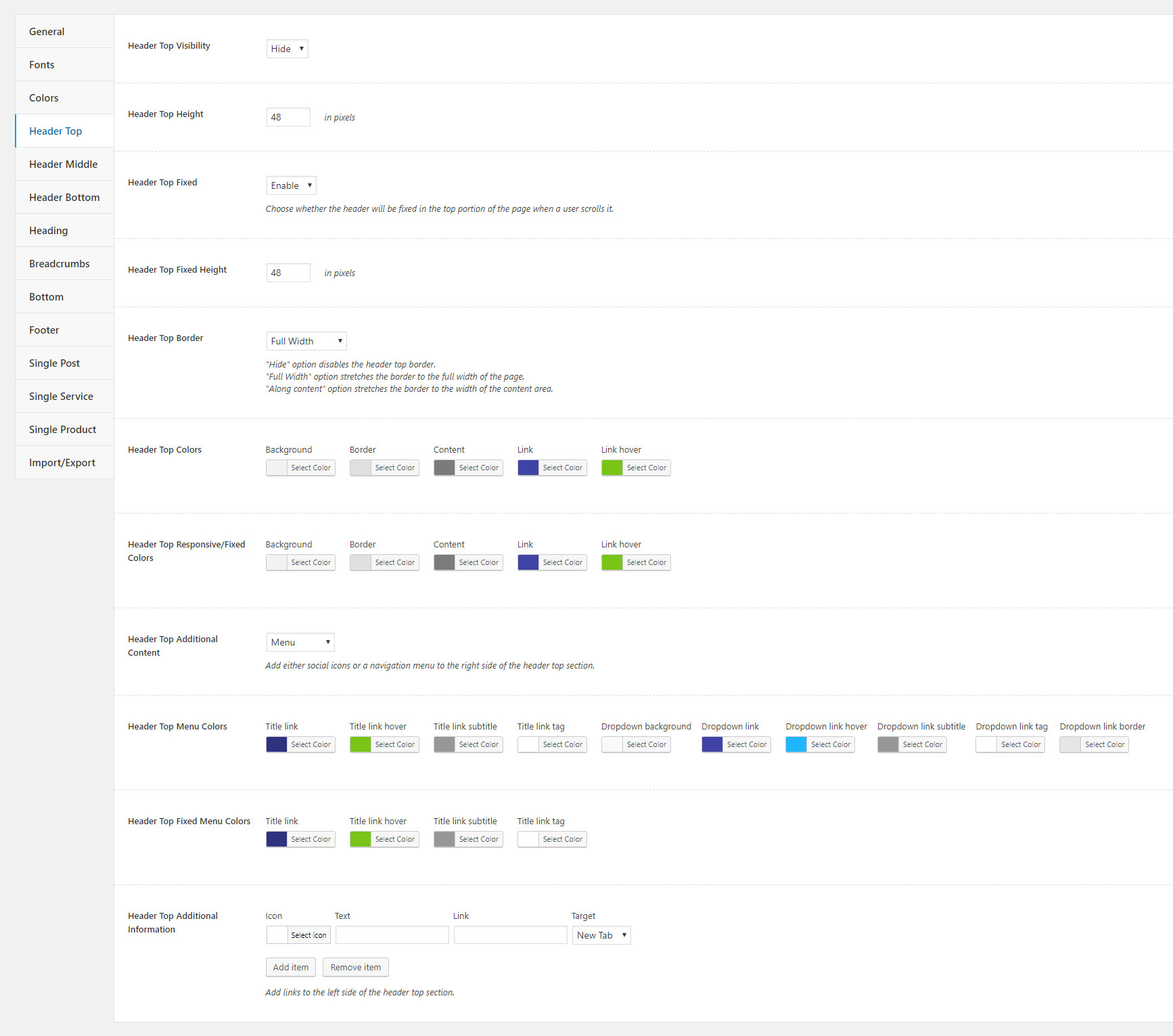
Header Top
- Header Top Visibility — controls the header top section visibility.
- Header Top Height — sets the header top section height.
- Header Top Fixed — choose whether the header top section will be fixed in the top portion of the page when a user scrolls it.
- Header Top Fixed Height — sets the height of the header top fixed section.
-
Header Top Border — sets the header top border type. There are three options:
- "Hide" disables the header top border;
- "Full Width" stretches the border to the full width of the page;
- "Along content" stretches the border to the width of the content area.
- Header Top Colors — allows you to set colors of the header top section.
- Header Top Responsive/Fixed Colors — sets colors of the header top fixed section.
- Header Top Additional Content — controls whether a navigation menu or social icons will be displayed on the right side of the header top section.
- Header Top Social Icons — using this option you can add social icons with links to the right side of the header top section.
- Header Top Menu Colors — sets colors of the header top navigation menu.
- Header Top Fixed Menu Colors — allows you to set colors of the header top fixed navigation menu.
- Header Top Additional Information — here you can add text and icons with links to the left side of the header top section.
Header Middle
- Header Middle Visibility — controls the header middle section visibility.
- Header Middle Height — sets the header middle section height.
- Header Middle Fixed — choose whether the header middle section will be fixed in the top portion of the page when a user scrolls it.
- Header Middle Fixed Height — sets the height of the header middle fixed section.
-
Header Middle Type — controls the header middle section layout. There are two options:
- "Default" displays the logo on the left and the rest of the content on the right;
- "Centered" disables the menu and displays the logo centered with the slogan on the left and the rest of the content on the right.
-
Header Middle Border — sets the header middle border type. There are three options:
- "Hide" disables the header middle border;
- "Full Width" stretches the border to the full width of the page;
- "Along content" stretches the border to the width of the content area.
- Header Middle Colors — allows you to set colors of the header middle section.
- Header Middle Responsive/Fixed Colors — sets colors of the header middle fixed section.
- Header Middle Menu Visibility — controls the header middle navigation menu visibility.
- Header Middle Menu Colors — sets colors of the header middle navigation menu.
-
Logo Image — allows you to set a logo image for your website.
- Logo Image For Responsive/Fixed — sets a logo image used in the fixed header.
- Logo Retina Image — allows you to set a logo image used on high DPI displays. The image for retina logo should be twice the size the image used in Logo Image.
- Logo Retina Image For Responsive/Fixed — sets a logo image used in the fixed header on high DPI displays. The image for retina logo should be twice the size the image used in Logo Image For Responsive/Fixed.
- Header Middle Fixed Menu Colors — allows you to set colors of the header middle fixed navigation menu.
- Header Middle Additional Information — here you can add text and icons with links to the left side of the header middle section.
- Header Middle Social Icons — using this option you can add social icons with links to the right side of the header middle section.
- Header Middle Button — sets up a button displayed on the right side of the header middle section.
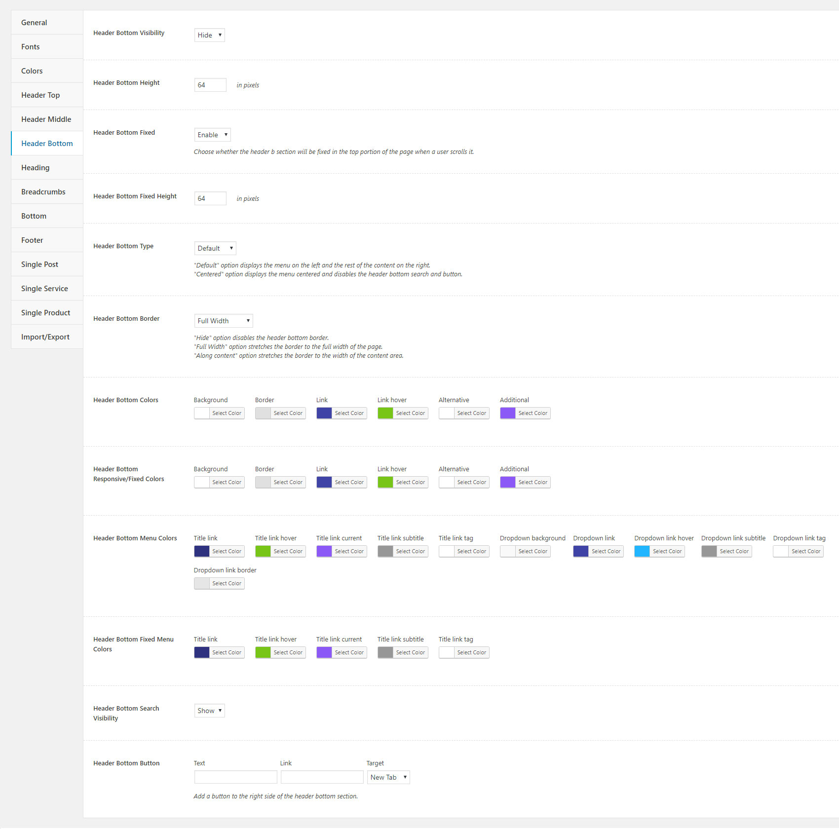
Header Bottom
- Header Bottom Visibility — controls the header bottom section visibility.
- Header Bottom Height — sets the header bottom section height.
- Header Bottom Fixed — choose whether the header bottom section will be fixed in the top portion of the page when a user scrolls it.
- Header Bottom Fixed Height — sets the height of the header bottom fixed section.
-
Header Bottom Type — controls the header bottom section layout. There are two options:
- "Default" displays the menu on the left and the rest of the content on the right;
- "Centered" displays the menu centered and disables the header bottom search and button.
-
Header Bottom Border — sets the header bottom border type. There are three options:
- "Hide" disables the header bottom border;
- "Full Width" stretches the border to the full width of the page;
- "Along content" stretches the border to the width of the content area.
- Header Bottom Colors — allows you to set colors of the header bottom section.
- Header Bottom Responsive/Fixed Colors — sets colors of the header bottom fixed section.
- Header Bottom Menu Colors — sets colors of the header bottom navigation menu.
- Header Bottom Fixed Menu Colors — allows you to set colors of the header bottom fixed navigation menu.
- Header Bottom Search Visibility — controls the header bottom search bar visibility.
- Header Bottom Button — sets up a button displayed on the right side of the header bottom section.
Heading
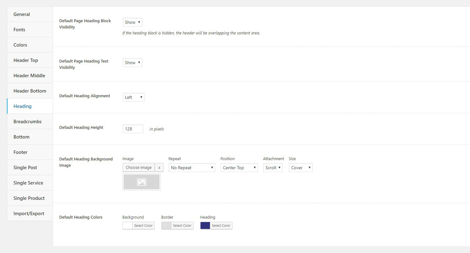
In this section you can configure the default heading settings, which are also applied to all automatically generated pages (archive page, search page, etc). Please note, that the first two options — Default Page Heading Block Visibility and Default Page Heading Text Visibility — are applied only to pages rather than to posts, services, and products.
- Default Page Heading Block Visibility — controls default heading visibility on pages, including archive and search pages.
- Default Page Heading Text Visibility — sets the default visibility of the heading text on pages, including archive and search pages.
- Default Heading Alignment — sets the default heading alignment on pages, including archive and search pages.. There are three options: left, right, and center.
- Default Heading Height — sets the default height of the heading section.
- Default Heading Background Image — allows you to set a default background image for the heading section.
- Default Heading Colors — allows you to set default colors of the heading section.
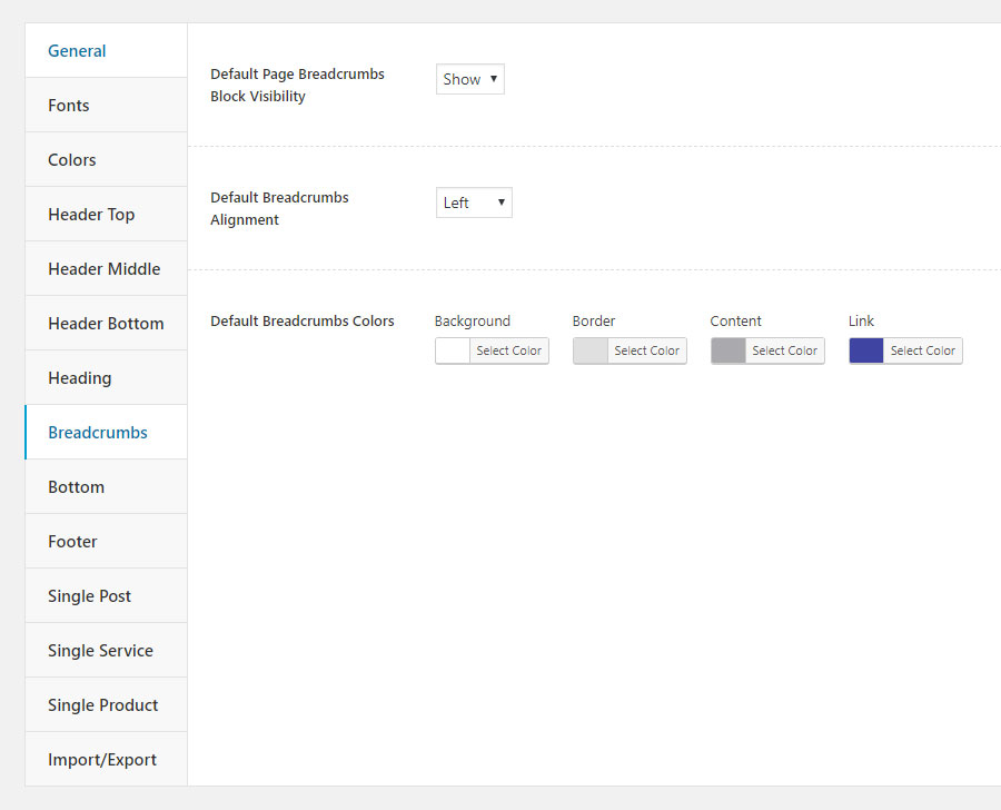
Breadcrumbs
In this section you can configure the default breadcrumbs settings, which are also applied to all automatically generated pages (archive page, search page, etc). Please note, that Default Page Breadcrumbs Block Visibility is applied only to pages rather than to posts, services, and products.
- Default Page Breadcrumbs Block Visibility — controls default visibility of the breadcrumbs section on pages, including archive and search pages.
- Default Breadcrumbs Alignment — sets default breadcrumbs alignment. There are three options: left, right, and center.
- Default Breadcrumbs Colors — allows you to set default colors of the breadcrumbs section.
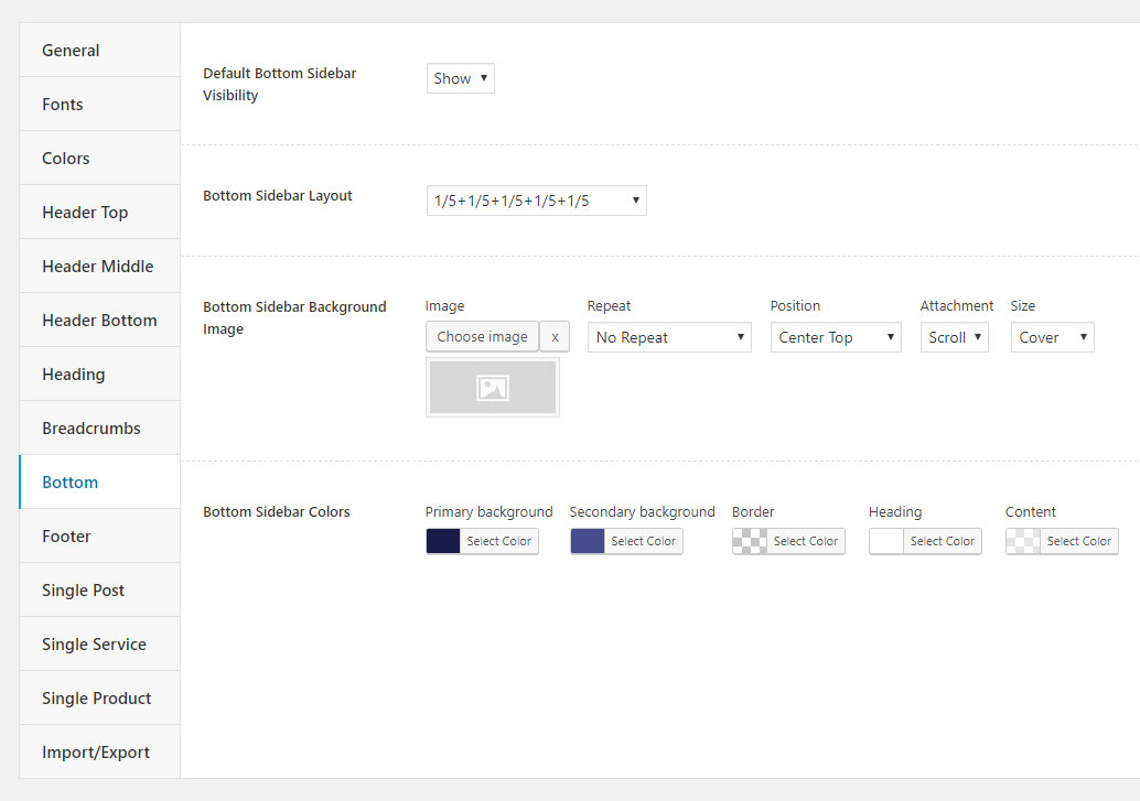
Bottom
In this section you can configure the default bottom sidebar settings, which are also applied to all automatically generated pages (archive page, search page, etc).
- Default Bottom Sidebar Visibility — controls default visibility of the bottom sideabar.
- Bottom Sidebar Layout — sets in how many columns the bottom sidebar section is split.
- Bottom Sidebar Background Image — allows you to set a background image for the bottom sidebar section.
- Bottom Sidebar Colors — here you can customize the bottom sidebar colors.
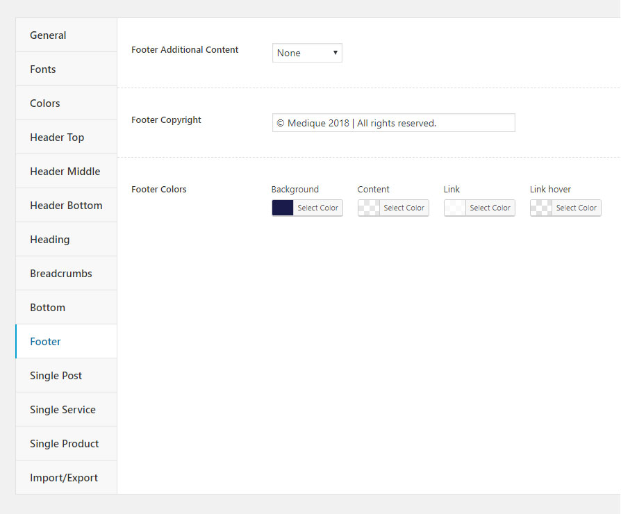
Footer
This section contains settings for configuring the footer section.
- Footer Additional Content — controls whether a navigation menu or social icons will be displayed on the right side of the footer section.
- Footer Social Icons — using this option you can add social icons with links to the right side of the footer section.
- Footer Copyright — using this option you can add copyright text to the left side of the footer section.
- Footer Colors — here you can customize the footer section colors.
Single Post
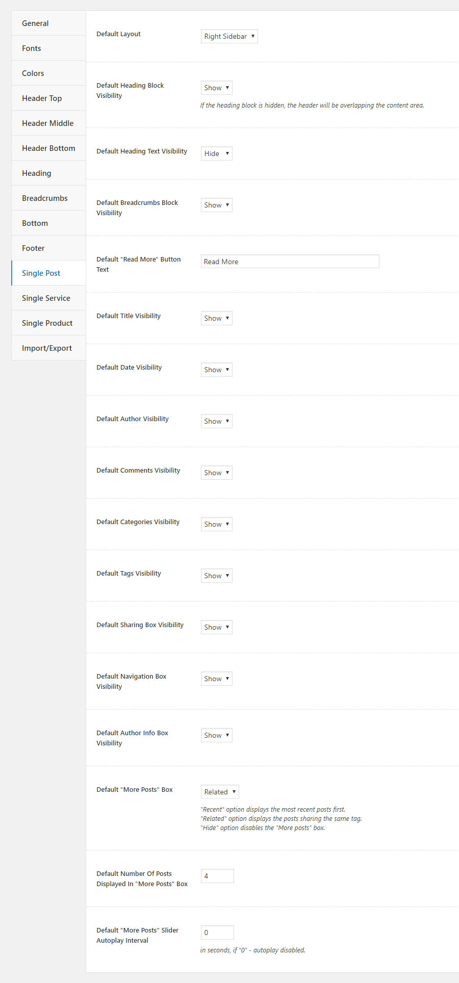
In this section you can configure the default settings for posts.
- Default Layout — sets the default post layout. There are three options: full width without sidebar, left sidebar, and right sidebar.
- Default Heading Block Visibility — controls the default heading visibility. If the heading block is hidden, the header will be overlapping the content area.
- Default Heading Text Visibility — sets the default heading text visibility.
- Default Breadcrumbs Block Visibility — controls the breadcrumbs section default visibility.
- Default "Read More" Button Text — sets default text of the "Read More" button in Webique Blog shortcode.
- Default Title Visibility — sets default visibility of the post title.
- Default Date Visibility — controls default visibility of the post date.
- Default Author Visibility — sets default visibility of the post author.
- Default Comments Visibility — controls default visibility of the comments counter.
- Default Categories Visibility — sets the post categories default visibility.
- Default Tags Visibility — controls the post tags default visibility.
- Default Sharing Box Visibility — sets default visibility of the sharing box.
- Default Navigation Box Visibility — controls default visibility of the navigation box.
- Default Author Info Box Visibility — sets default visibility of the post author info box.
-
Default "More Posts" Box — controls default visibility of the "More Posts" box.There are three options:
- "Recent" displays the most recent posts first;
- "Related" displays the posts sharing the same tag;
- "Hide" disables the "More posts" box.
- Default Number Of Posts Displayed In "More Posts" Box — controls the default number of posts displayed in "More Posts" box.
- Default "More Posts" Slider Autoplay Interval — sets the default autoplay interval of the "More Posts" slider in seconds. The value "0" disables the autoplay.
Single Services
In this section you can configure the default settings for services.
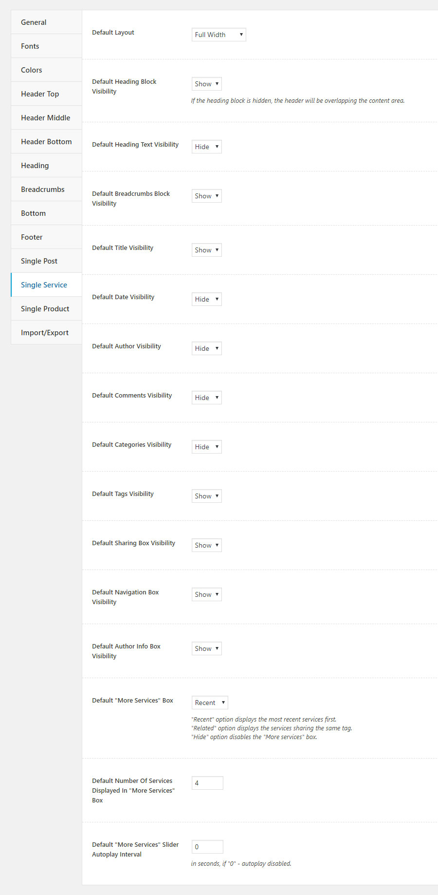
- Default Layout — sets the default service layout. There are three options: full width without sidebar, left sidebar, and right sidebar.
- Default Heading Block Visibility — controls the default heading visibility. If the heading block is hidden, the header will be overlapping the content area.
- Default Heading Text Visibility — sets the default heading text visibility.
- Default Breadcrumbs Block Visibility — controls the breadcrumbs section default visibility.
- Default Title Visibility — sets default visibility of the service title.
- Default Date Visibility — controls default visibility of the service date.
- Default Author Visibility — sets default visibility of the service author.
- Default Comments Visibility — controls default visibility of the comments counter.
- Default Categories Visibility — sets the service categories default visibility.
- Default Tags Visibility — controls the service tags default visibility.
- Default Sharing Box Visibility — sets default visibility of the sharing box.
- Default Navigation Box Visibility — controls default visibility of the navigation box.
- Default Author Info Box Visibility — sets default visibility of the service author info box.
-
Default "More Services" Box — controls default visibility of the "More services" box.There are three options:
- "Recent" displays the most recent services first;
- "Related" displays the services sharing the same tag;
- "Hide" disables the "More services" box.
- Default Number Of services Displayed In "More Services" Box — controls the default number of services displayed in "More services" box.
- Default "More Services" Slider Autoplay Interval — sets the default autoplay interval of the "More services" slider in seconds. The value "0" disables the autoplay.
Single Product
In this section you can configure the default settings for products.
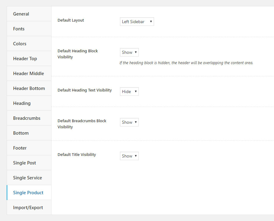
- Default Layout — sets the default product layout. There are three options: full width without sidebar, left sidebar, and right sidebar.
- Default Heading Block Visibility — controls the default heading visibility. If the heading block is hidden, the header will be overlapping the content area.
- Default Heading Text Visibility — sets the default heading text visibility.
- Default Breadcrumbs Block Visibility — controls the breadcrumbs section default visibility.
- Default Title Visibility — sets default visibility of the product title.
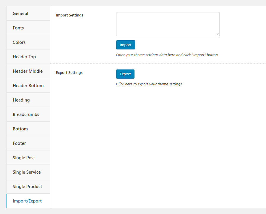
Import/Export
In this section you can export/import theme settings.
- Export Settings — this option allows you to easily export the settings as a backup for future reusability. The settings will be exported in medique-settings.txt file.
- Import Settings — here you can import settings by inserting encoded settings to the text area.
Page Options
Our theme provides two options for configuring pages attributes: globally in Theme Settings and individually on each page. Every page in the theme contains a set of options allowing you to customize it according to your needs. When you edit a page, you will see a Theme Options box below the content editor containing following options:
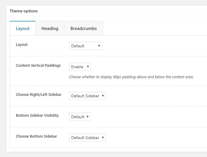
Layout
The section contains the layout settings.
- Layout — here you can choose the page layout. There are four options: full width without sidebar, left sidebar, right sidebar, and default.
- Content Vertical Paddings — choose whether to display 80px padding above and below the content area.
- Choose Right/Left Sidebar — choose a sidebar to display on the right or left side of the page.
- Bottom Sidebar Visibility — controls visibility of the bottom sideabar.
- Choose Bottom Sidebar — choose a sidebar to display on the bottom of the page.
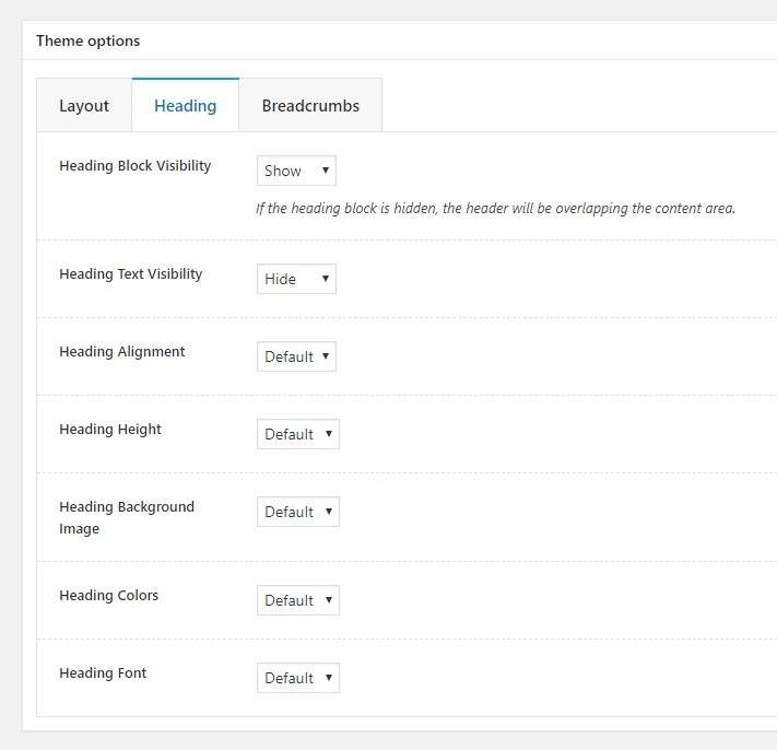
Heading
In this section you can configure the heading settings.
- Heading Block Visibility — controls the heading visibility. If the heading block is hidden, the header will be overlapping the content area.
- Heading Text Visibility — controls the heading text visibility.
- Heading Alignment — sets the heading alignment.
- Heading Height — sets the heading height.
- Heading Background Image — allows you to set a background image for the heading section.
- Heading Colors — allows you to customize the heading section colors.
- Heading Font — allows you to customize the heading section font.
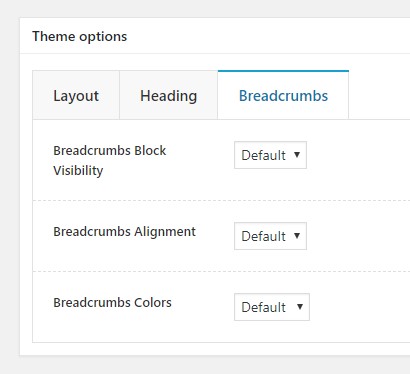
Breadcrumbs
In this section you can configure the breadcrumbs settings.
- Breadcrumbs Block Visibility — сontrols visibility of the breadcrumbs section.
- Breadcrumbs Alignment — sets breadcrumbs alignment. There are three options: left, right, center, and default.
- Breadcrumbs Colors — allows you to set colors of the breadcrumbs section.
Post Options
Our theme provides two options for configuring posts attributes: globally in Theme Settings and individually on each post. Every post in the theme contains a set of options allowing you to customize it according to your needs. When you edit a post, you will see a Theme Options box below the content editor containing following options:
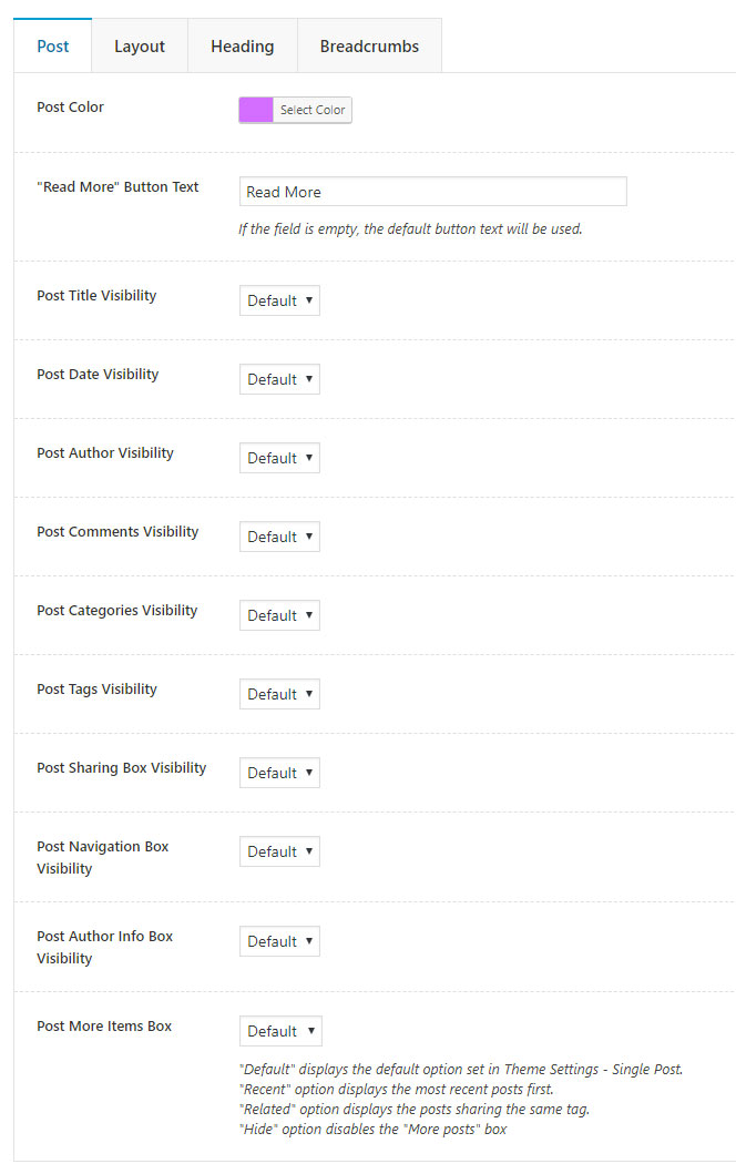
Post
In this section you can configure the basic post attributes.
- Post Color — here you can set the post color, which is used as categories color on the single post page and the post categories/some design elements color in Webique Blog shortcode.
- "Read More" Button Text — sets text of the "Read More" button in Webique Blog shortcode.
- Post Title Visibility — sets visibility of the post title.
- Post Date Visibility — controls visibility of the post date.
- Post Author Visibility — sets visibility of the post author.
- Post Comments Visibility — controls visibility of the comments counter.
- Post Categories Visibility — sets the post categories visibility.
- Post Tags Visibility — controls the post tags visibility.
- Post Sharing Box Visibility — sets visibility of the sharing box.
- Post Navigation Box Visibility — controls visibility of the navigation box.
- Post Author Info Box Visibility — sets visibility of the post author info box.
-
Post More Items Box — controls visibility of the "More Posts" box. There are four options:
- "Default" displays the default option set in Theme Settings - Single Post;
- "Recent" displays the most recent posts first;
- "Related" displays the posts sharing the same tag;
- "Hide" disables the "More posts" box.
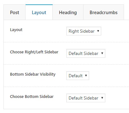
Layout
The section contains layout settings.
- Layout — here you can choose the post layout. There are four options: full width without sidebar, left sidebar, right sidebar, and default.
- Choose Right/Left Sidebar — choose a sidebar to display on the right or left side of the post.
- Bottom Sidebar Visibility — controls visibility of the bottom sideabar.
- Choose Bottom Sidebar — choose a sidebar to display on the bottom of the post.
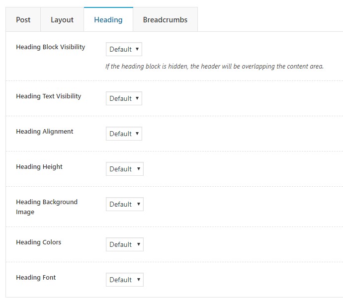
Heading
In this section you can configure the heading settings.
- Heading Block Visibility — controls the heading visibility. If the heading block is hidden, the header will be overlapping the content area.
- Heading Text Visibility — controls the heading text visibility.
- Heading Alignment — sets the heading alignment.
- Heading Height — sets the heading height.
- Heading Background Image — allows you to set a background image for the heading section.
- Heading Colors — allows you to customize the heading section colors.
- Heading Font — allows you to customize the heading section font.
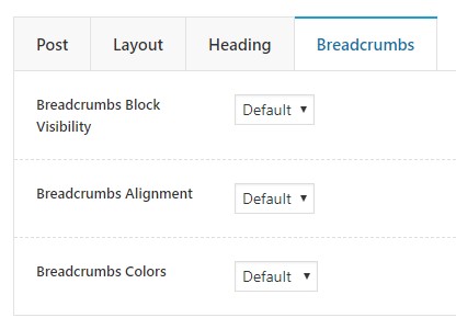
Breadcrumbs
In this section you can configure the breadcrumbs settings.
- Breadcrumbs Block Visibility — сontrols visibility of the breadcrumbs section.
- Breadcrumbs Alignment — sets breadcrumbs alignment. There are three options: left, right, center, and default.
- Breadcrumbs Colors — allows you to set colors of the breadcrumbs section.
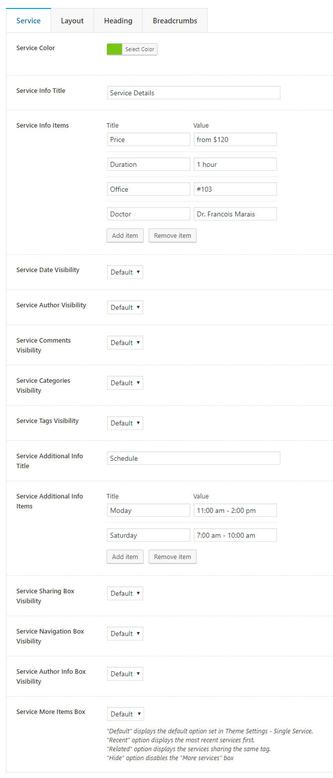
Service Options
Our theme provides two options for configuring services attributes: globally in Theme Settings and individually on each service. Every service in the theme contains a set of options allowing you to customize it according to your needs. When you edit a service, you will see a Theme Options box below the content editor containing following options:
Service
In this section you can configure the basic service attributes.
- Service Color — here you can set the services color, which is used as design elements color on the single service page and the service categories/design elements color in Webique Services shortcode.
- Service Title Visibility — sets visibility of the service title.
- Service Info Title — allows you to configure the info box title.
- Service Info Items — allows you to add and configure the info box items.
- Service Date Visibility — controls visibility of the service date.
- Service Author Visibility — sets visibility of the service author.
- Service Comments Visibility — controls visibility of the comments counter.
- Service Categories Visibility — sets the service categories visibility.
- Service Tags Visibility — controls the service tags visibility.
- Service Additional Info Title — allows you to configure the addtional info box title.
- Service Additional Info Items — allows you to add and configure the addtional info box items.
- Service Sharing Box Visibility — sets visibility of the sharing box.
- Service Navigation Box Visibility — controls visibility of the navigation box.
- Service Author Info Box Visibility — sets visibility of the service author info box.
-
Service More Items Box — controls visibility of the "More services" box.There are four options:
- "Default" displays the default option set in Theme Settings - Single Service.
- "Recent" displays the most recent services first.
- "Related" displays the services sharing the same tag.
- "Hide" disables the "More services" box.
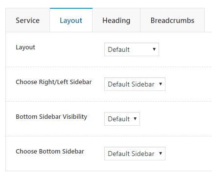
Layout
The section contains layout settings.
- Layout — here you can choose the service layout. There are four options: full width without sidebar, left sidebar, right sidebar, and default.
- Choose Right/Left Sidebar — choose a sidebar to display on the right or left side of the service.
- Bottom Sidebar Visibility — controls visibility of the bottom sideabar.
- Choose Bottom Sidebar — choose a sidebar to display on the bottom of the service.
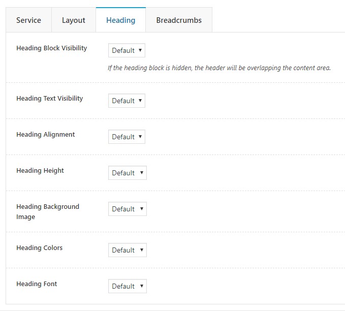
Heading
In this section you can configure the heading settings.
- Heading Block Visibility — controls the heading visibility. If the heading block is hidden, the header will be overlapping the content area.
- Heading Text Visibility — controls the heading text visibility.
- Heading Alignment — sets the heading alignment.
- Heading Height — sets the heading height.
- Heading Background Image — allows you to set a background image for the heading section.
- Heading Colors — allows you to customize the heading section colors.
- Heading Font — allows you to customize the heading section font.
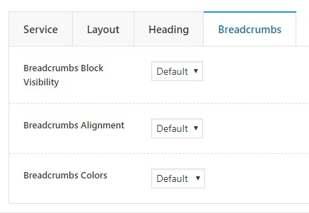
Breadcrumbs
In this section you can configure the breadcrumbs settings.
- Breadcrumbs Block Visibility — сontrols visibility of the breadcrumbs section.
- Breadcrumbs Alignment — sets breadcrumbs alignment. There are three options: left, right, center, and default.
- Breadcrumbs Colors — allows you to set colors of the breadcrumbs section.
Product Options
Our theme provides two options for configuring products attributes: globally in Theme Settings and individually on each product. Every product in the theme contains a set of options allowing you to customize it according to your needs. When you edit a product, you will see a Theme Options box below the content editor containing following options:
Layout
The section contains the layout settings.
- Layout — here you can choose the product layout. There are four options: full width without sidebar, left sidebar, right sidebar, and default.
- Content Vertical Paddings — choose whether to display 80px padding above and below the content area.
- Choose Right/Left Sidebar — choose a sidebar to display on the right or left side of the product.
- Bottom Sidebar Visibility — controls visibility of the bottom sideabar.
- Choose Bottom Sidebar — choose a sidebar to display on the bottom of the product.
Heading
In this section you can configure the heading settings.
- Heading Block Visibility — controls the heading visibility. If the heading block is hidden, the header will be overlapping the content area.
- Heading Text Visibility — controls the heading text visibility.
- Heading Alignment — sets the heading alignment.
- Heading Height — sets the heading height.
- Heading Background Image — allows you to set a background image for the heading section.
- Heading Colors — allows you to customize the heading section colors.
- Heading Font — allows you to customize the heading section font.
Breadcrumbs
In this section you can configure the breadcrumbs settings.
- Breadcrumbs Block Visibility — сontrols visibility of the breadcrumbs section.
- Breadcrumbs Alignment — sets breadcrumbs alignment. There are three options: left, right, center, and default.
- Breadcrumbs Colors — allows you to set colors of the breadcrumbs section.
Webique Shortcodes
Medique comes bunddled with WPBakery Page Builder plugin, a powerful tool for creating page content. It has very simple and intuitive interface, but you may find it useful to get accustomed with its documentation:
https://kb.wpbakery.com/docs/learning-more
In addition to the WPBakery shorcodes, we provide our own custom shortcodes and modified some of the WPBakery shorcodes to extend the theme functionality further.
Modified Shortcodes
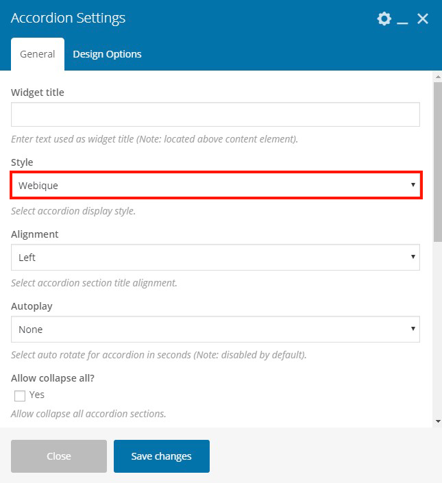
Accordion
Added Webique style.
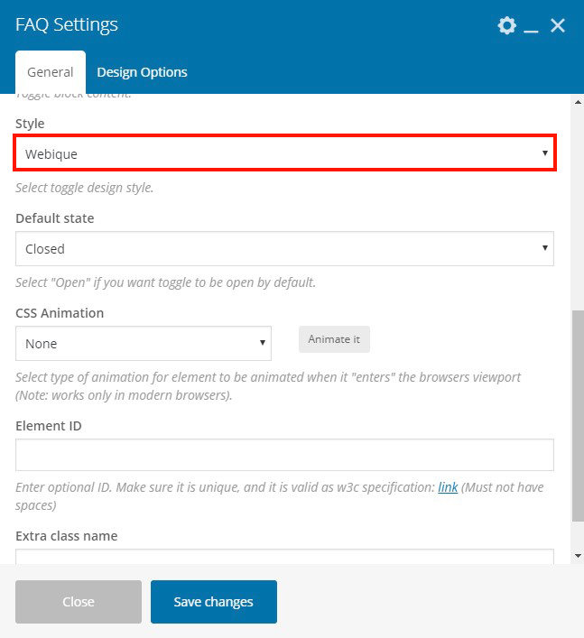
FAQ
Added Webique style.
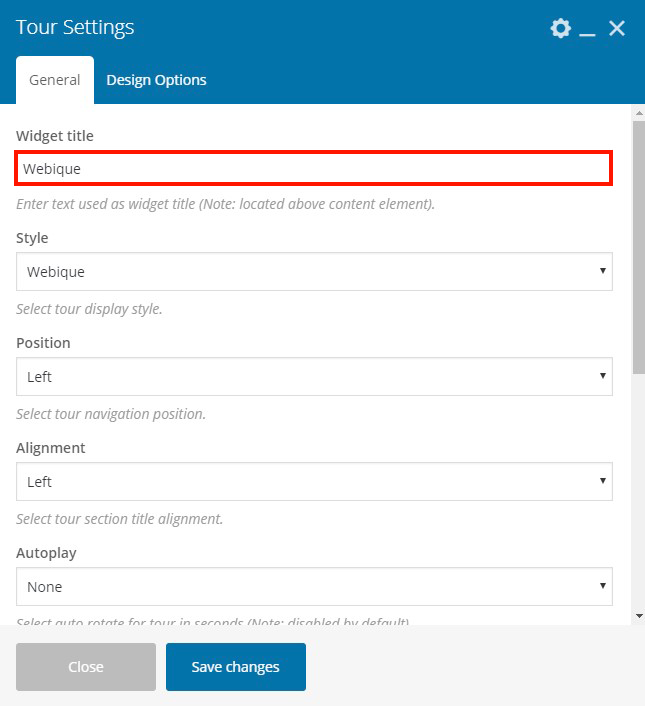
Tour
Added Webique style.
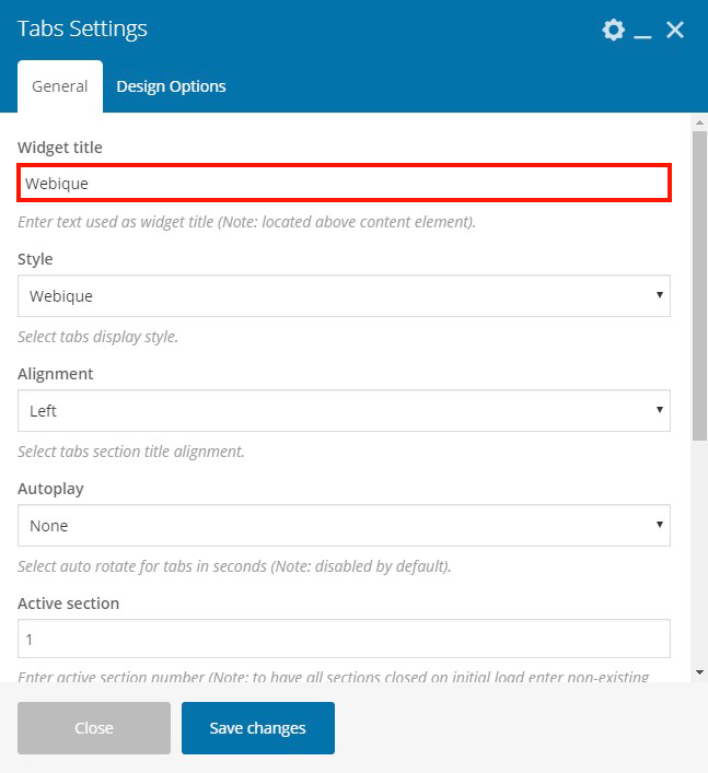
Tabs
Added Webique style.
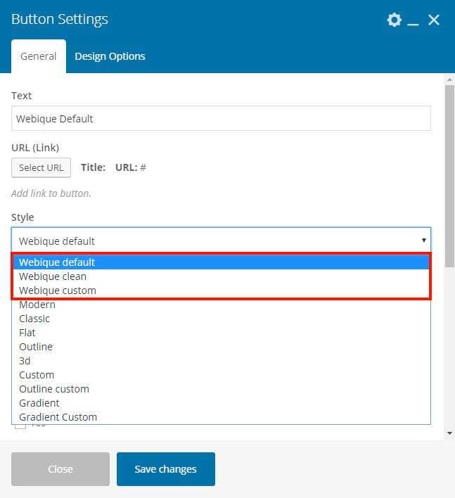
Button
Added Webique, Webique Clean, and Webique Custom styles. All Webique styles allows you to customzie the button's typography. Wtih Webique Clean style you can customize button text color and text color on hover. Using Webique Custom style you can fully customize all the button's features.
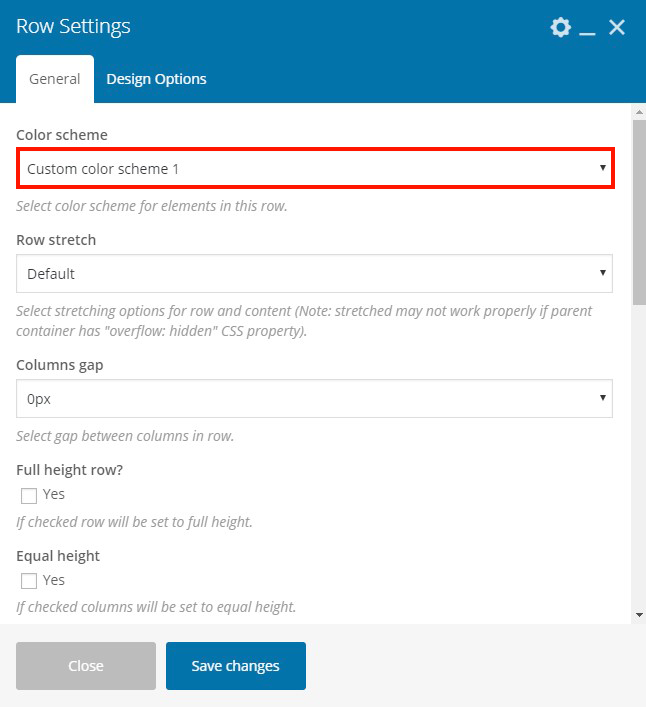
Row
We added Color scheme option, which allows you to use different color schemes set in Theme Settings - Colors to customize the "Row" element's contains.
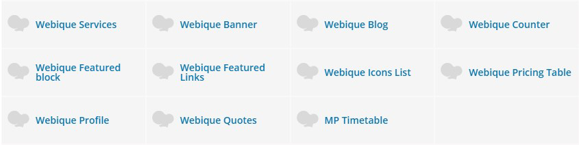
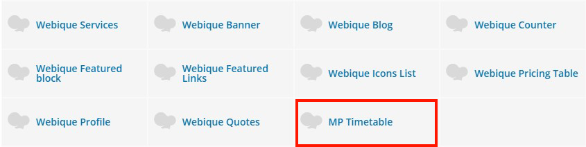
Added Shortcodes
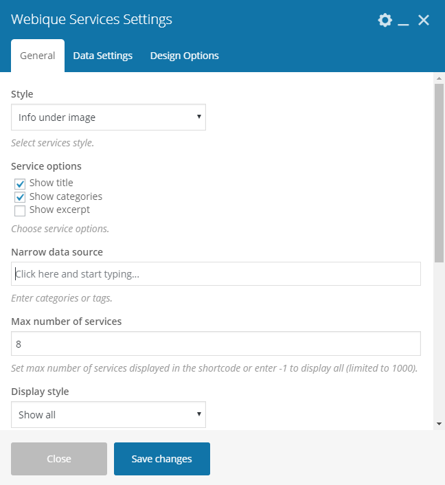
Webique Services
This shortcode allows you to add services on any page. You can choose from three different styles of Services element: infor on image, info under image, and slider.
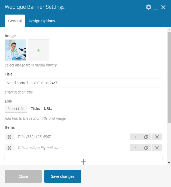
Webique Banner
This shortcode allows you to create a banner with an image and text with icons.
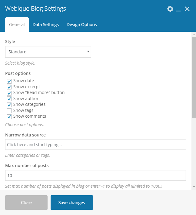
Webique Blog
This shortcode allows you to add blog on any page. You can choose from five different styles of Blog element: standard, columns, slider, list, and list with images.
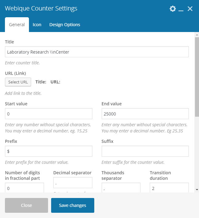
Webique Counter
This shortcode creates a counter with icons or images.
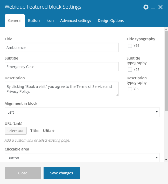
Webique Featured Block
This shortcode allows you to create a featured text block with images, customizable border types, and icons.
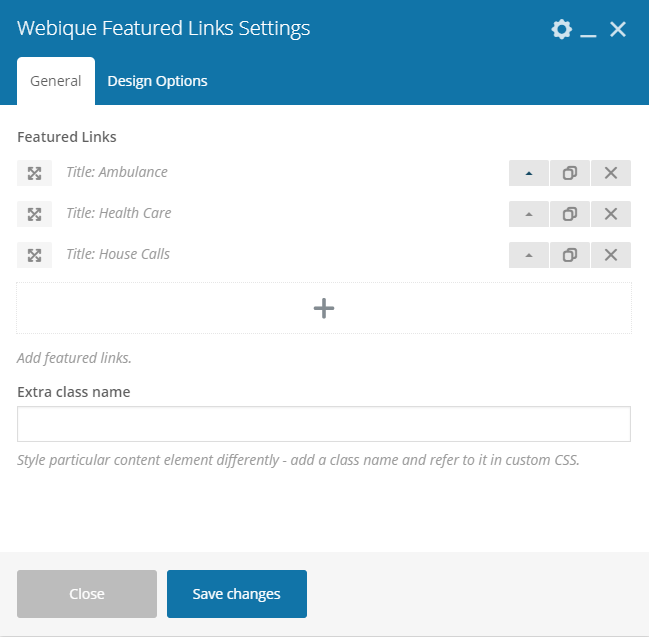
Webique Featured Links
This shortcode allows you to create featured links with icons and customizable color settings.
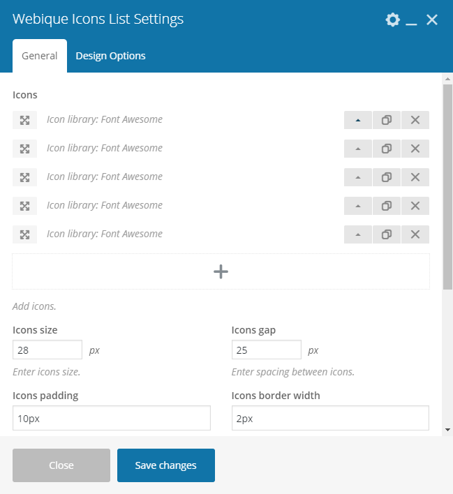
Webique Icons List
This shortcode allows you to create an icon list.
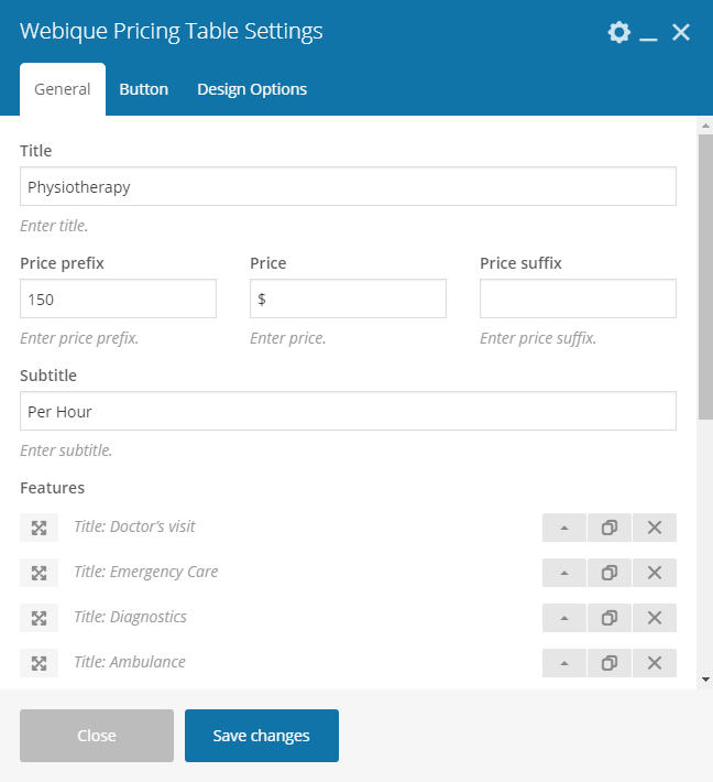
Webique Pricing Table
This shortcode allows you to create a pricing table.
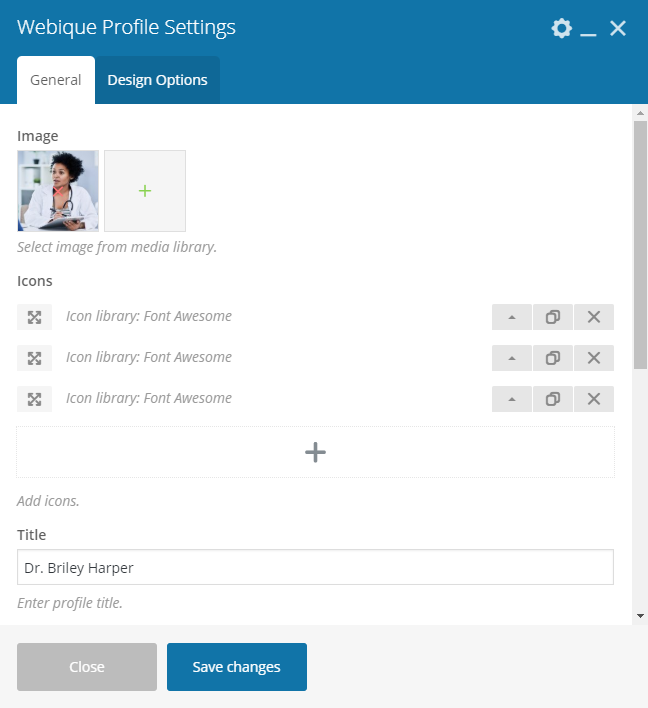
Webique Profile
This shortcode allows you to create a profile block.
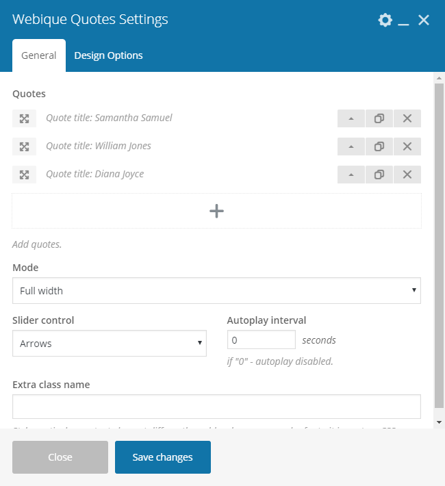
Webique Quotes
This shortcode allows you to create a quotes block. There are three styles of Quotes element: boxed, fullwidth, and vertical.
WooCommerce
Medique is fully compatible with WooCommerce plugin, so you can build a nice shop loaded with features and options. Since WooCommerce is an external plugin, you will find any information you may need about it on the WooCommerce author’s page. Here are several useful links:
We recommend installing WooCommerce plugin during the theme installation along with other recommended plugins, however, you can install and activate it anytime in Appearance - Theme Plugins.
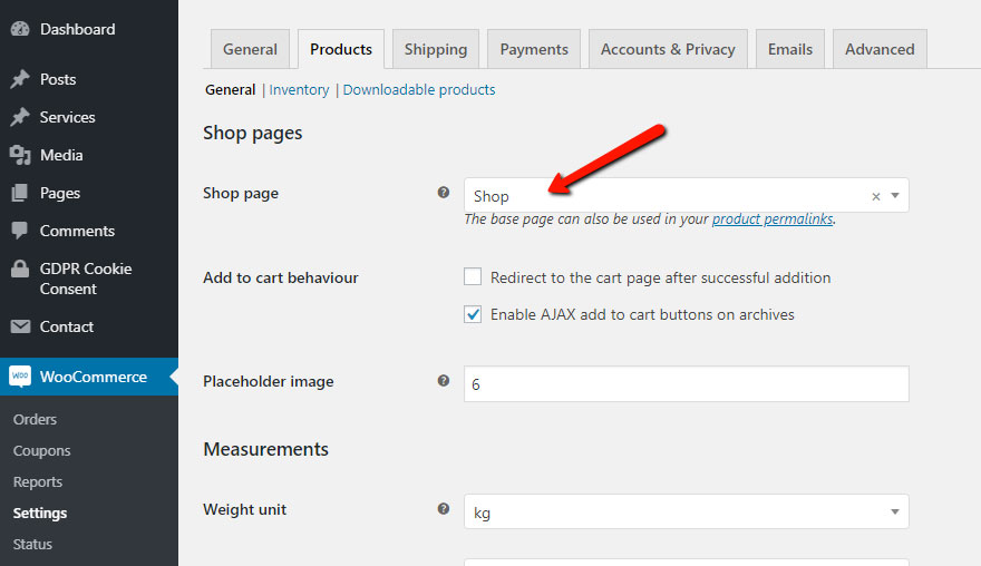
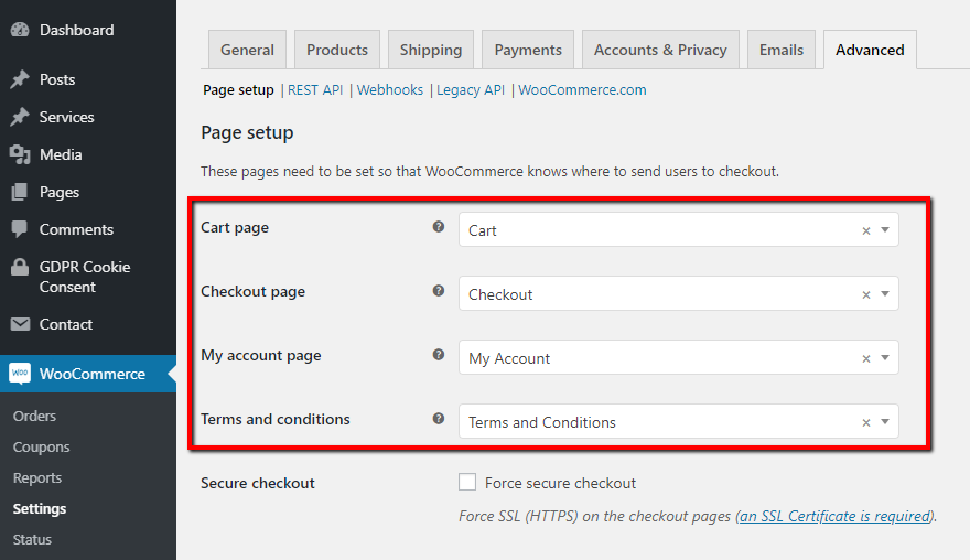
After activating WooCommerce plugin, please proceed to WooCommerce - Settings - Products - General, set the Shop page, and after that set Cart, Checkout, and My Account in WooCommerce - Settings - Advancedf - Page Setup as shown in the screenshots below.
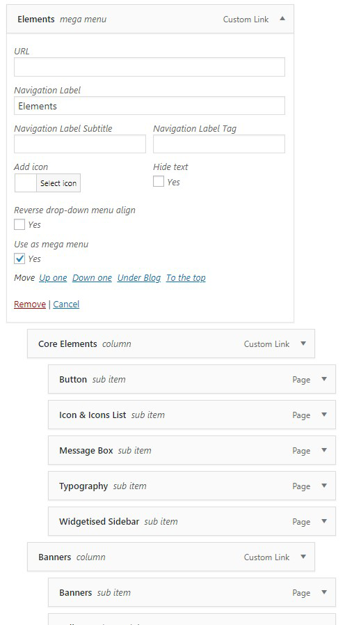
Navigation Menu
One of the features our Webique Framework plugin provides is an extension of the navigation menu options. We have enhanced the default navigation menu functionality with new options listed below.
- Navigation Label Subtitle — allows to set a navigation label subtile .
- Navigation Label Tag — sets a navigation label tag.
- Add icon — allows you to add an icon to a navigation menu item.
- Hide text — controls visibility of the navigation menu item text.
- Reverse drop-down menu align — sets the drop-down menu alignment.
- Use as mega menu — allows you to use the drop-down menu as mega menu to arrange navigation menu items into columns.
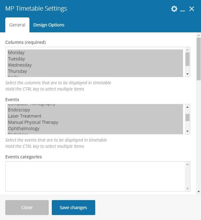
Timetable
Any medical healthcare facility requires an effective solution to notify patients about the schedule. Our theme is designed to be the most convenient tool for creating medical websites, and to turn timetables creation and management into an easy and convenient process, we integrated Medique with Timetable and Event Schedule plugin. The plugin provides lots of options, with which you can get accustomed in the plugin's documentation.
To make adding timetable to individual pages even more convenient, we have created MP Timetable shortcode integrated in WPBakery Page Builder plugin. With help of this shortcode, you can easily add and manage a timetable on any page, post or service.
Translation
In order to translate the theme and Webique Framework plugin you have to create and translate the .mo/.po files. Those files work in pairs, so for each language you need to have 2 files with the same name but a different extension. For example, if you want to translate into French language, your files would be fr_FR.mo and fr_FR.po.
To create and edit these files you need to use Poedit an easy to use software application. Simply upload the files into Poedit, edit them and upload them into the "languages" folder included in the theme.
For translating the theme, proceed to /wp-content/themes/medique/languages and open medique.pot file with Poedit, click Create translation at the bottom of the app, and choose the needed language. After that .mo/.po files will be automatically created and you will see a list with all words and secntences available for translation. After finishing the translation, save the files, and make sure they are located in /wp-content/themes/medique/languages directory.
You can translate Webique Framework plugin the same way, but please note that webique-framework.pot is located in /wp-content/plugins/webique-framework/languages direcory.